Raw numbers alone aren’t enough to tell a good story. Data visualization transforms dry quantitative data into something far more tangible and easy to understand (Jeff Cardello, 2022).
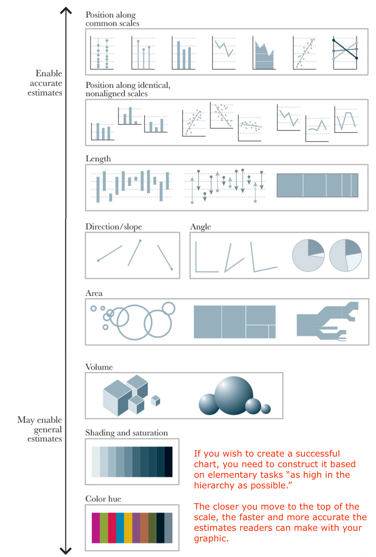
Data visualization is a mix of science and art. We are familiar with comparing data in standard graphs like line and bar charts, they are easy to create and are perceptually more accurate. Nonstandard graphs - for example those that use circles or curves may not allow the reader to most accurately perceive the exact data values (see the image below). Choosing one of the two graphs is not a wise approach. Accuracy is not always the goal. We sometimes may need these nonstandard graphs to first attract attention to the visualization.

Perceptual Ranking Diagram. This image is based on Alberto Cairo (2016) from research by Cleveland and McGill (1984), Heer, Bostock, and Ogievetsky (2010), and others.
There are many reasons for data visualization in the scientific research process. In this guide, we emphasize two aspects in particular:
(Source from: Schwabish, J. A. (2021). Better data visualizations : a guide for scholars, researchers, and wonks. Columbia University Press.)